
A recent survey found that the #1 challenge for brokers was understanding their agent’s performance.
This challenge was followed closely by an inability to discern how the brokerage was performing in a timely manner. While most brokers knew what metrics to look at, they didn’t always know how to find them. Others, meanwhile, had all the data at their fingertips but didn’t understand what the data was saying.
To be honest, processing and understanding raw data is a struggle for a lot of people. Organized data can be, too. In fact, nearly half of the world’s population can’t easily process data in a numerical way. This difficulty is potentially due to the theory of right-brain and left-brain dominance, which accounts for creativity on the right and analytical processing on the left. Generally, Sales is more of a right-brained activity, focusing on emotional intelligence and communication. An accountant, meanwhile, may be considered more left-brain dominant due to their ability to easily process numbers.
For millennia, humans have used visual representation for communication. Cave drawings. Hieroglyphics. Kanji. Our species is hard-wired to process visual stimuli nearly 60,000 times faster than words. Numbers are no different.
There are studies that indicate that language is decoded on a linear level, while images are deciphered on a simultaneous level. This means that an image can be immediate, while language requires time to analyze. Data visualization can cut to the chase, saving that critical time and allowing the next step in developing solutions. (Brenner, 2016)
Data visualization may be the key to understanding agent and brokerage performance.
Most brokers cobble together data from various sources to get a picture of their performance metrics, usually including seasonal and annual volume, profit and loss, sides, commission rates, average deal price, and more. It’s a tedious process to pull this data together for each agent and for the brokerage as a whole. When you factor in the time and effort it takes to analyze the information and decipher actionable intelligence, it’s no wonder why brokers would want to avoid their data.
The first step in solving this problem is for brokers to have all of their data in a single repository.
Generating reports and visual analysis are only as good as the data feeding them. This means that brokers need a single system or an integrated network of systems to analyze multiple sources of data that may all be contributing to the success or failure of the brokerage or agent.
The second step is deciding what questions to ask (of their data). Not every visualization will provide actionable intelligence, so it’s critical that the right questions are being asked and that the graphics represent all the data points that contribute to a given challenge or solution. As our industry evolves, brokerages and vendors need to collaborate to determine the most pertinent questions of today and tomorrow. Questions like:
- How profitable are each of my agents?
- Which is my agents' most successful season?
- Where am I spending the most amount of my money?
The third step is taking that data and putting it into easily digestible graphics for brokers to see where their brokerage is excelling and where it’s falling short. Not only will this reduce the amount of time to analyze the data, but it will also make it easier and faster for agents to understand during planning and coaching sessions.
So where do we come in? Meet Lone Wolf Analytics!
Let’s look at some data visualizations in Lone Wolf Analytics
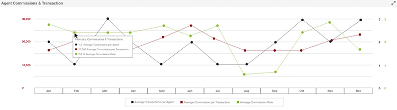
This report, built out with Lone Wolf Analytics, shows you how your entire agent team is performing on average. On this graph, you’ll see the Average Transaction per Agent, Average Commission per Transaction, and Average Commission Rate at a glance. With this information, a Broker/Owner can better understand the ups and downs of their agent’s performance, information that can be used for more accurate planning and coaching.
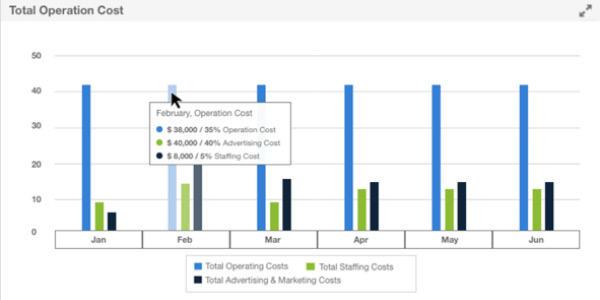
In a nut shell, this Lone Wolf Analytics report shows you where you’re spending your money. Here you can see where your money is going per month—operational costs, staffing costs, advertising and Marketing costs etc. Seeing this information can help a Broker/Owner get a better scale of how their costs compare to one another, knowledge that could be used to make more profitable decisions.
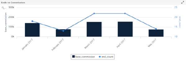
With this report, you can see an individual agent’s performance per month, including their base commission and end count. This information can help a Broker/Owner understand how each of their agents are performing over time, see trends and react to them. This improves your ability to intervene in dips in performance and coach your agents on a timely basis.
These are just three of the many data visualizations you can create using Lone Wolf Analytics. Check out this page to learn more about Lone Wolf Analytics.
On average, those using data visualization tools report it would take an average of nine hours or longer to see patterns, trends and correlations in their company’s data without data visualization (SAP News, 2014)
Numbers can be misleading if they aren’t reviewed in context. Using data visualization, brokerages will no longer be blind to the trends shaping the success of their business. The door to a profitable brokerage is right in front of us and data visualization may be the key.
Want to learn more about what Analytics can do for your brokerage? Take a closer look at Lone Wolf Analytics and our back office accounting solution.